

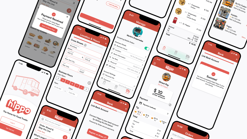
Function – UX/UI Design & Research Contractor. Part of a team that overhauled the design of Hippo Tab, a platform that offers both food truck vendors and customers a convenient ordering and payment destination for their favorite street food.
Mission – Encourage further appreciation of the unique culinary pleasure of food trucks, by offering a platform that consistently serves both the vendors that make food trucks great, and the customers who keep them moving forward.
Background –
Hippo Tab’s founder came to my team members and I with a proof-of-concept web-based application looking to optimize the order management and payment process for food truck vendors. We were tasked with conducting further user research, creating a product roadmap based on this research, and redesigning the application to better optimize key workflows.
Research & Roadmap –
When conducting further user research, our primary goal was to validate what the founder had previously identified as vendor or customer pain points. We wanted to make sure Hippo Tab knew what problems were available to solve in this space, and that they identified the right problems they could solve.
Our primary method of conducting this user research was to go out in the field – chatting with food truck vendors and their customers in New York City. A great result of this was enjoying some great food. However, a frequent challenge we encountered was the language barrier when chatting with vendors specifically. Often times food trucks are a great first step into the culinary industry, particularly for more recent immigrants, and is especially the case in New York City. Often my team members and I did not speaking their native languages. However, this led to one of our richest insights for our redesign – we must keep the text simplified throughout the application to ensure easy understanding for any non-native english speaking food truck vendors.
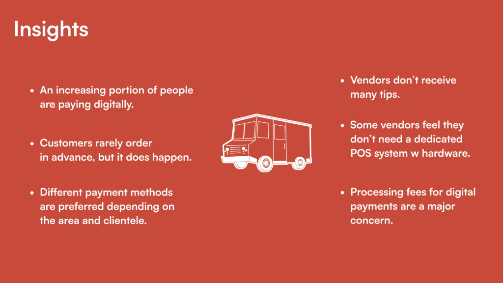
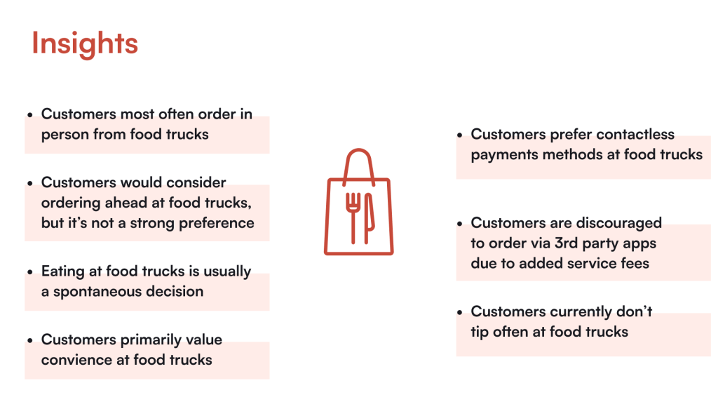
Below you can see some of our additional research insights we gathered from both food truck vendors and customers
From here we synthesized these insights into personas for each Hippo Tab user group, vendors and customers. These personas were particularly valuable when validating that Hippo Tab was solving the right problem for each of these user groups. Additionally, they could provide roadmap direction as the Hippo Tab continued to expand in the future.
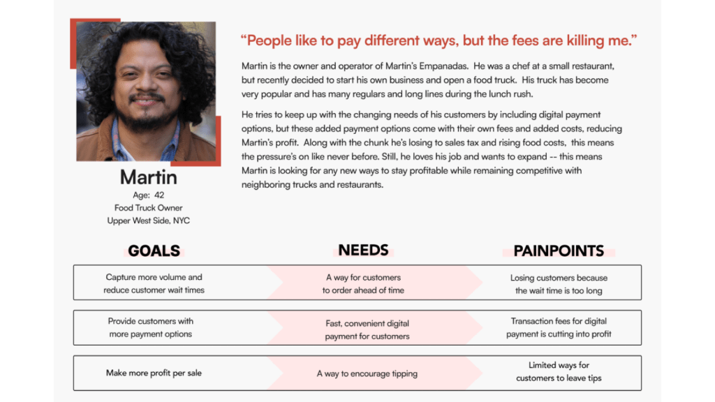
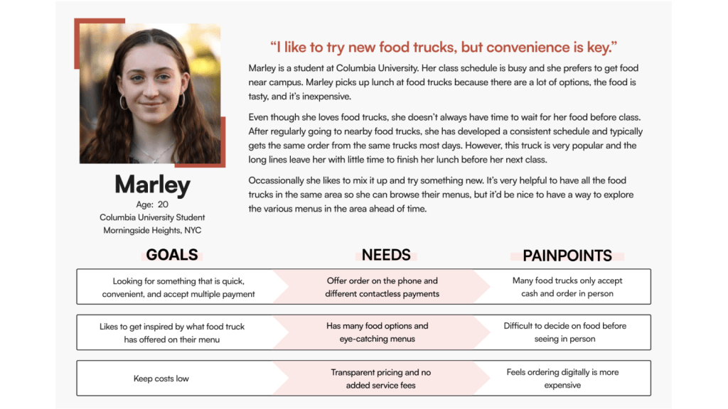
A couple key takeaways here include
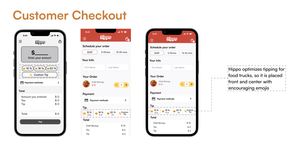
- Vendors were concerned with the fees that come with digital payment options, of which the cost of being part of the Hippo Tab marketplace could be included. However, if the rate of tipping could increase by using Hippo Tab then that would flip a concern into a selling point for membership in the marketplace.
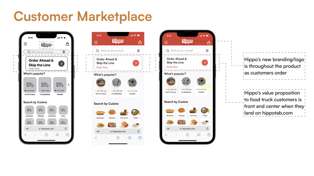
- While Customers wanted the option to order digitally, it was for multiple reasons. In part it was to decrease wait time if they thought the line would be long. However, it was also for more transparency on the menu options of different trucks and the cost of them.
Design –
As we moved to the redesign phase our goal was to collaborate with Hippo Tabs’ founder to build a foundation that their development team could continue to build off of. This included a distinct design language and system that gave Hippo Tab an identity, while maintaining readability. This also included focusing on the key areas of value Hippo Tab could provide.
Design Language & System
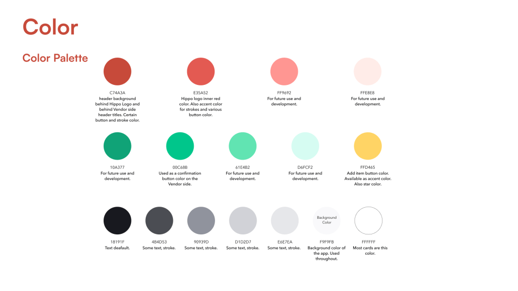

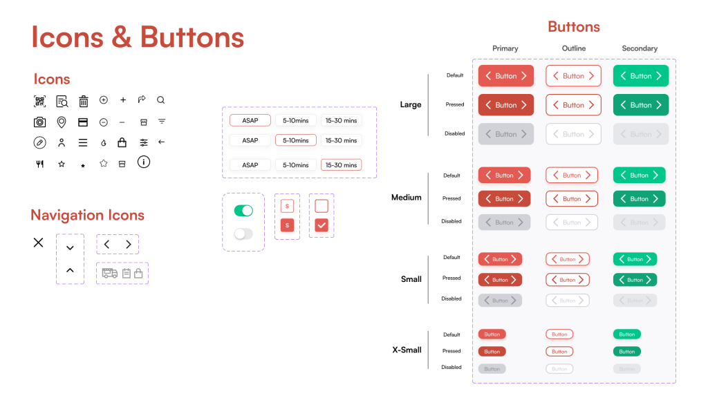
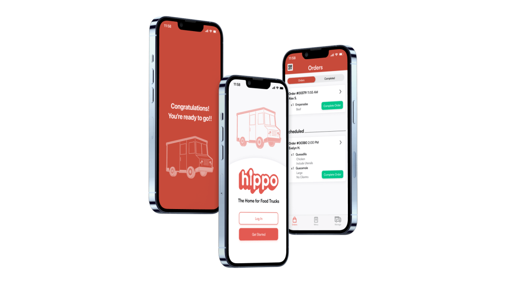
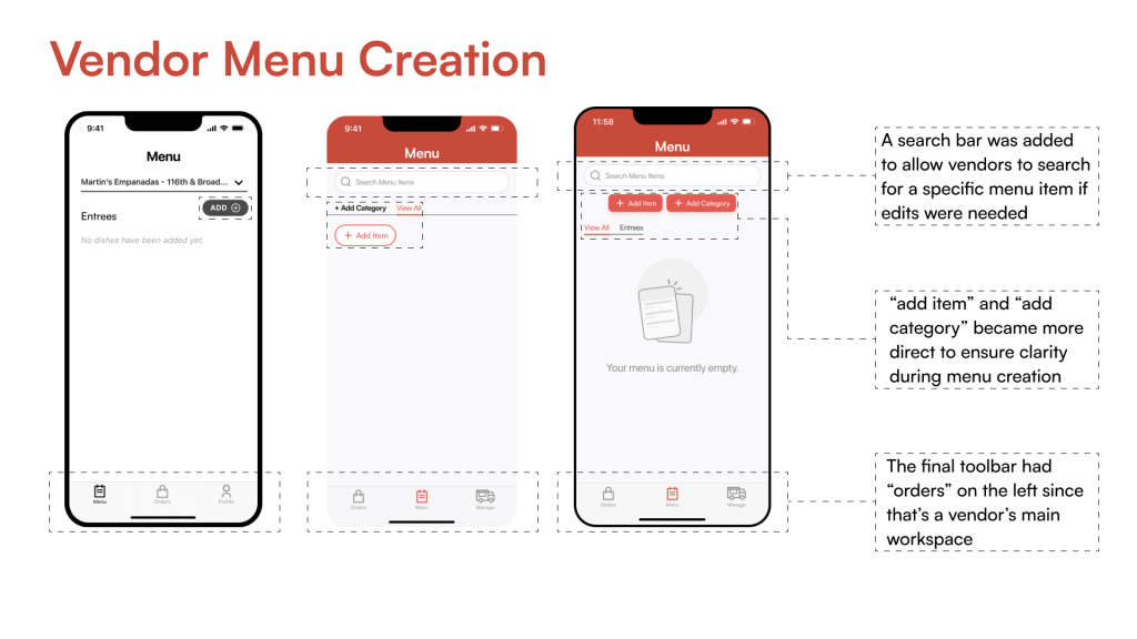
Eye-catching, while maintaining a simplicity and quick readability that empowers food truck vendors and converts food truck customers.
Lessons Learned –
My work with Hippo Tab was well-received by Hippo Tab’s founder. In particular he appreciated having a better sense of direction.
- User experience that prioritized Vendor’s value on increasing tipping. Even with associated Hippo Tab fees, the additional revenue stream of tipping was a huge selling point in a crowded food-app marketplace
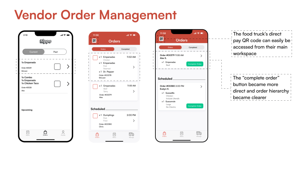
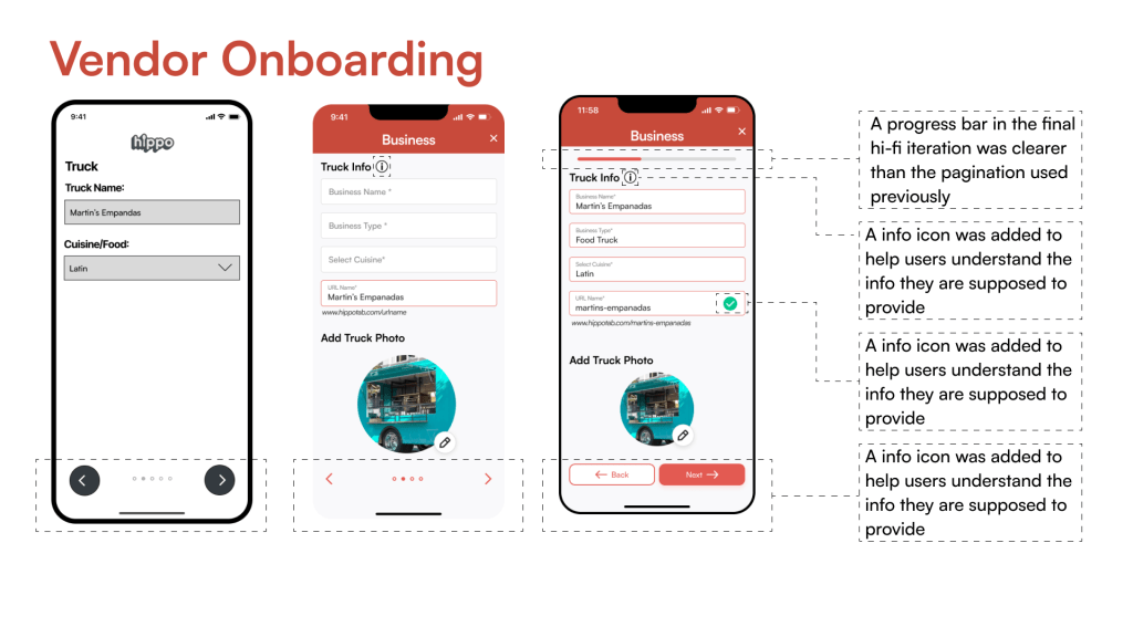
- User experience that focused on readability and empowered transparency. Addressed food truck customers’ transparency needs, and empowered non-native English speaking vendors
 Zac Sewall